Burberry rebranding: from minimalism to the knight’s return
Why Burberry moved from its 2018 minimalist identity to the revived knight in 2023, with practical lessons for distinctive brand redesigns.
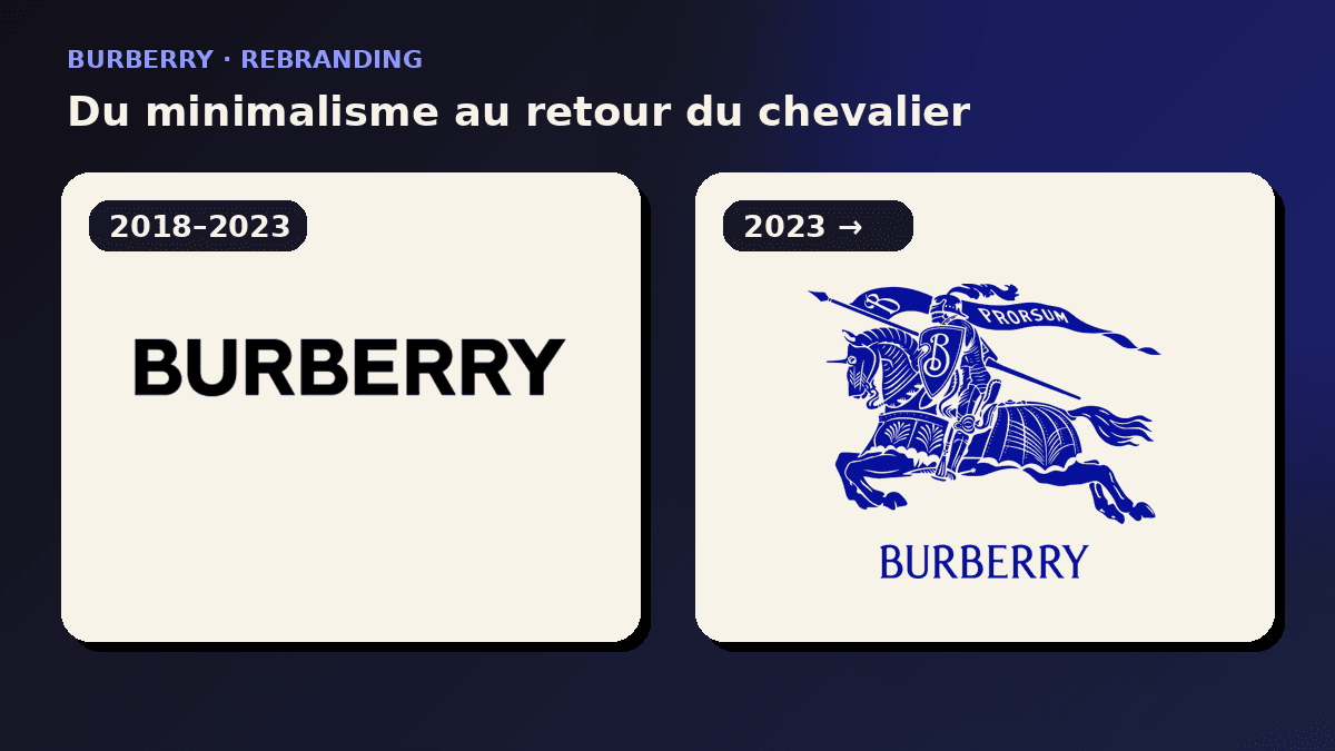
Between 2018 and 2023, Burberry made one of luxury branding’s most discussed turns: first an uppercase sans-serif wordmark and TB monogram, then the prominent return of the Equestrian Knight Device. This analysis separates documented changes, design logic and practical lessons for any identity redesign.
Before 2018: a heritage that had never stood still
Burberry began in 1856 with outerwear and Thomas Burberry’s practical approach to weatherproof clothing. Its visual identity, however, was never limited to one permanent drawing. The name, the check, the trench silhouette and the Equestrian Knight Device have carried different levels of emphasis across products, campaigns and decades. The knight emerged in the early twentieth century carrying a flag marked “Prorsum”, a Latin word commonly translated as “forward”. That detail matters because the emblem communicates inheritance and motion at the same time.
The Equestrian Knight Device is unusually dense by current logo standards: horse, armour, lance, flag and a B on the shield all compete for attention. This density creates narrative value but makes the mark fragile at small sizes. Burberry therefore used wordmarks, simplified locks-ups and the complete emblem in different contexts long before the latest debate. The 2023 return should not be read as a museum restoration. It is a fresh hierarchy within a brand system whose symbols have always moved between foreground and background.
2018: Riccardo Tisci and Peter Saville make a clean break
Riccardo Tisci’s arrival as chief creative officer in 2018 created the conditions for a visible reset. Working with designer Peter Saville, Burberry introduced an uppercase sans-serif wordmark: broad, direct and stripped of the aristocratic cues associated with the former serif signature. A repeating TB monogram, referring to Thomas Burberry, supplied a second asset for products and campaign graphics.
The design answered practical needs. A sturdy sans-serif survives a mobile screen, a social post, a shop sign and fast-moving video. It is easier to align across markets than a detailed illustration. The monogram offered a pattern that could become physical material rather than merely a corporate signature. Describing the project as “removing the knight” therefore misses its operational ambition. It created a modular toolkit for a fashion house producing an enormous volume of images, objects and retail applications.
Why fashion minimalism looked rational
During the late 2010s, several fashion houses simplified their wordmarks. Critics labelled the convergence “blanding”: distinctive signatures appeared to be turning into similar geometric capitals. The criticism captured a real loss of visual variety, yet it often ignored production constraints. A global mark must remain legible in a tiny profile image, on an ecommerce page, beside other brands, on packaging and in vertical video.
The 2018 Burberry wordmark performs many of those tasks well. It has clear spacing, strong contrast and very little that can break during reproduction. Its direct tone supported Tisci’s desired rupture with the previous era. Its weakness was not basic function but the cost of distinction. Once the knight and serif texture left the main signature, the brand moved closer to a shared luxury vocabulary. Campaign art direction and product codes then had to work harder to make a technically efficient name feel unmistakably Burberry.
Where the 2018 system became vulnerable
A rebrand has to survive outside its launch presentation. The sans-serif wordmark could look exact and confident inside a tightly art-directed campaign, then appear generic when separated from photography and product. The TB monogram added ownership, but new monograms need to be learned. Without context it did not connect to Burberry as instantly as the written name, the check or the knight.
This is a question of distinctive assets rather than personal taste. The trench, check and Equestrian Knight Device hold accumulated cultural memory. Reducing their visibility does not erase that memory, but it asks other elements to compensate. Minimal systems succeed when imagery, colour, product and voice are unusually consistent. If those components shift from season to season, a neutral wordmark cannot carry the full burden. Efficiency may rise while unaided recognition becomes more dependent on media spend and repetition.
2023: Daniel Lee brings the knight back into view
In February 2023, under creative director Daniel Lee, Burberry unveiled a new visual expression. The name returned in a more characterful serif wordmark. More dramatically, the Equestrian Knight Device reappeared in a finely rendered form, frequently shown in an intense electric blue. “Prorsum” was legible on the flag again. The historical reference was obvious, while the colour and spacious layouts kept it from feeling like sepia nostalgia.
The knight supplies qualities the previous main signature expressed less directly: a scene, movement, a motto and a recognisable connection to British heritage. Blue makes the archive feel active rather than preserved. The serif wordmark restores typographic contrast in a market crowded with uppercase sans-serifs. Together, these components generate a more ownable silhouette in image feeds where many luxury names had become difficult to tell apart without their surrounding campaigns.
What the revived identity actually changes
The return of a detailed emblem does not require it to appear on every surface. A mature identity needs levels: a wordmark for narrow spaces, the full Equestrian Knight Device for editorial moments, a smaller detail or initial for compact applications, and the check when product and context support it. The advantage lies in orchestration. Printing the most complex version everywhere would recreate the reproduction problems that encouraged simplification in the first place.
The strategic change is that Burberry has moved a proprietary asset back to the centre of its story. A generic serif can be copied; this specific knight, shield and motto belong to the house’s history. The phrase “forward” also frames heritage as action rather than retreat. Blue, cropping and scale can change from campaign to campaign while preserving a cultural texture that the 2018 wordmark had to obtain mainly from its context.
Minimalism versus heritage is the wrong contest
It is tempting to call the 2018 identity a mistake and the 2023 identity a complete correction. That reading is too neat. The first system served a period that wanted rupture, speed and digital consistency. The second serves a period that needs difference, narrative and renewed ownership of the archive. Both expose a normal tension for an old company: remaining current without becoming interchangeable.
Minimalism is valuable when it clarifies and dangerous when it removes the only clues a brand can truly own. Heritage is valuable when it is edited and burdensome when reproduced without hierarchy. Burberry suggests that a rebrand can use both lessons. A company may keep the functional discipline learned during a minimalist phase, then reintroduce historical assets through contemporary colour, spacing, animation and responsive variants.
Six lessons for any brand considering a redesign
First, inventory distinctive assets before drawing. A neglected symbol, colour, pattern or composition may carry more memory than a fashionable new treatment. Second, separate simplification from sameness: removing detail can improve clarity, but each subtraction should be tested against recognition. Third, test a system rather than one hero logo across an avatar, packaging, signage, motion and ordinary internal documents.
Fourth, build levels of complexity instead of forcing one lock-up into every size. Fifth, document the role of each asset so teams do not choose marks randomly. Sixth, design continuity deliberately. A new identity can still retain one recognisable form, colour, idea or rhythm that helps audiences connect the chapters. The goal is not to prevent change. It is to spend existing recognition wisely while making the business easier to understand now.
Burberry, Decathlon and Nokia: three different redesign problems
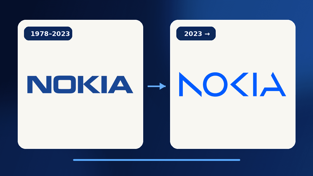
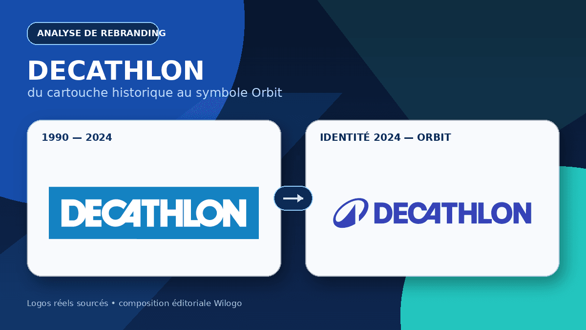
Burberry becomes clearer when compared with other recent programmes. Decathlon added the Orbit symbol to unite a global sports ambition around movement. Nokia fragmented its historic wordmark to signal a corporate focus on networks, cloud and infrastructure rather than consumer-phone nostalgia. Burberry revived an old emblem to recover distinctiveness.
None of these surface moves is a universal recipe. Adding a symbol, breaking letters or reopening an archive only works when it answers a real strategic and cultural problem. Copying the blue, serif type or illustrated crest would imitate appearance without reproducing the reasoning. The useful question is simpler: which part of our identity helps people recognise us and understand where we are going, and on which touchpoints should that part lead?
How to audit your own identity using the Burberry case
Place your logo beside five competitors in black and white, without product photography. Note which features still feel identifiable. Then reduce it to avatar size and print it small. Record what disappears, but do not assume every detail must be deleted. A responsive secondary mark may solve the small-size problem without impoverishing the primary signature.
Interview customers and long-serving colleagues about the elements they remember without prompting. Look for signs preserved on older products, locations and user-generated photographs. Finally, connect each proposed change to a specific use. A new typeface should fix a real reading problem; an emblem needs room and priority rules; a colour needs reproducible values. Burberry’s chapters show that identity can evolve without declaring the previous period worthless. The task is to adjust hierarchy as strategy and culture change.
Conclusion: moving forward with the archive
The Burberry rebrand is less an aesthetic U-turn than a change of priority. In 2018 the house emphasised clarity, modularity and rupture. In 2023 it elevated a source of distinction built over more than a century. The blue knight does not cancel digital requirements; it makes a family of signatures more important than one drawing forced into every placement.
For a younger business, the lesson is not to invent a fake coat of arms. It is to identify authentic assets: a shape rooted in the product, a typographic rhythm, a colour, a gesture or a verifiable story. Durable modernity rarely comes from copying a trend. It comes from balancing present constraints with elements that no competitor can claim with the same legitimacy.
FAQ
Why did Burberry change its logo in 2018?
Under Riccardo Tisci, the house wanted a direct, modular expression suited to contemporary media. Peter Saville created the sans-serif wordmark and TB monogram for rapid use across global touchpoints.
Did Burberry abandon minimalism in 2023?
The new direction gives serif type and the Equestrian Knight Device greater prominence, but not every application has to become complex. Responsive identity still requires simpler signatures at small sizes.
What does “Prorsum” mean?
The Latin word is commonly translated as “forward”. On the knight’s flag it connects a historic emblem with an active idea of progress.
What is the main lesson from the Burberry rebrand?
Technical simplification should not erase genuinely distinctive assets. Strong systems define several levels of complexity and a clear role for each sign.
Should a company revive an old emblem?
Only when research shows that it remains recognisable, relevant and adaptable. Heritage should be edited for present use rather than copied as decoration.